
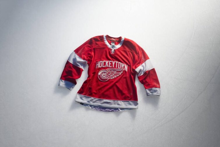
Alongside the rest of the NHL, the Detroit Red Wings unveiled their Hometown Remix jerseys on Monday.
Introducing Hometown Remix.
The city you know and love, brought to life in a way you can wear proudly. #NHLHometownRemix @NHL @Fanatics https://t.co/Tb4qz38Yy7
— Detroit Red Wings (@DetroitRedWings) November 2, 2026
Hometown Remix is a league-wide initiative led by jersey manufacturer Fanatics, similar to the Reverse Retro program in the 2021 and 2022-23 seasons. The jerseys are meant to “uniquely and authentically celebrates the fans, city, and local culture of each team.”
Detroit’s primary method of celebration is to add a “Hockeytown” text treatment to the Winged Wheel logo, similar to the second version of the team’s Hockeytown logo.
-

- Detroit Red Wings Hometown Remix Jersey (Credit: Fanatics/NHL)
-
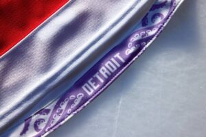
- “Hangar Effect” on the Detroit Red Wings Hometown Remix Jersey (Credit: Fanatics/NHL)
The jersey design itself is based on the team’s home jersey, with a white collar instead of red and white cuffs on the sleeves. Numbers and letters appear in a bold, rounded font, with an extension on the crossbar of the Alternate Captain’s A.
There is also a depiction of unofficial team mascot Al the Octopus on the inside of the back hem, only visible as a “hangar effect.”
The Flying D logo from the team’s 2016 Stadium Series jersey appears on the pants.
Detroit will first face a Hometown Remix jersey tonight in Florida, with the Panthers wearing their new jersey. The Red Wings did not immediately announce dates when they would wear their Hometown Remix jersey.
I rarely approve of design decisions coming from the Detroit organization. After really liking the team’s Centennial jerseys, though, I had higher hopes that weren’t met for the Hometown Remix design.
The striping updates actually make a lot of sense to me. The white cuffs and white collar breaks up the red of the team’s traditional home jersey nicely.
The crest is… Nothing. Slapping the “Hockeytown” text up there is about the least that the Red Wings could have done. All of the ways that the City of Detroit could have been celebrated there and, what a surprise, they just happened to decide that the best way was one that they already had trademarked. It could be worse, I’m sure, but it comes across as remarkably low-effort, especially in comparison to some of the other teams (even those that didn’t hit the mark).
I have complicated feelings about the Old English D but I really think the Red Wings need to start making more use of that. A jersey that is supposed to specifically represent the hometown would have been a great time to lean in on that logo. Along those lines, the logo on the pants could easily have been used as a crest.
If they’d followed in Montreal’s footsteps and used elements from the city flag, I probably would have lost my mind.
I don’t care about hangar effects but I’m glad they didn’t put Al on the front, like the Carolina Hurricanes did with their mascot.
It feels a lot like a giveaway jersey. The first 5000 fans get a “Hockeytown” shirsy sponsored by DQS.
It’s not terrible, it’s also not very good, and that seem to be how the team rolls in these league-wide initiatives.
Related Posts
-
 Nov 23, 2015
Red Wings Unveil Stadium Series Jersey
-
 Sep 19, 2024
Griffins Unveil New Jersey Designs
-
 Sep 7, 2002
Griffins Unveil Detroit-styled Jersey
-
 Sep 15, 2025
Red Wings Unveil Centennial Season Sweater

