I mentioned this on Twitter earlier today but figured it’s worth a quick post here.
We found out two weeks ago that the Red Wings would be removing their “Hockeytown” logo from center ice at Little Caesars Arena. At the time, center ice on the team’s practice rink still used that logo. Today, however, we got the first look at that facility’s Hockeytown-less neutral zone.
Switching over to the practice rink to scrimmage #RedWings pic.twitter.com/IXrb88OwIu
— Ted Kulfan (@tkulfan) September 6, 2018
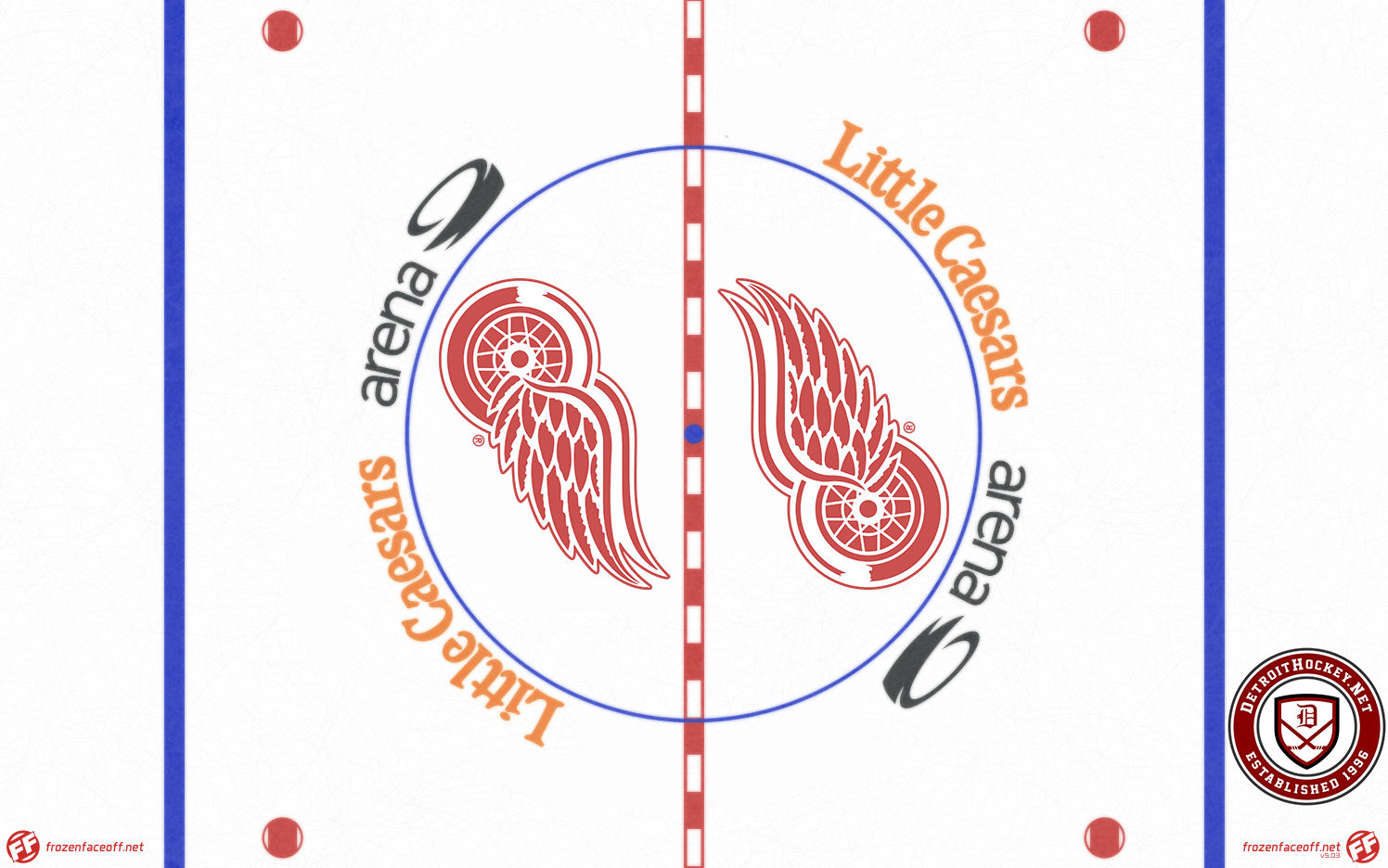
As I said two weeks ago, I’m absolutely fine with the Hockeytown logo being removed. Seeing the updated practice rink, however, inspired me to draw up what I actually want to see the Red Wings use.
Note: Center ice template and base artwork courtesy Frozen Faceoff.
For reference, see their actual 2019 design.
The Little Caesars Arena wordmark is awkward under the best circumstances, as it attempts to blend the serifed, outdated Little Caesars text with a sans-serif, lowercase font for “arena” (followed by the arena logo itself). Having that wordmark straddle the red line makes it worse. To fix this, I take the “top” version of the arena wordmark, spin it 90 degrees, then copy that (rotated 180 degrees) to the opposite side of the faceoff circle.
All last season I found the “Little Caesars” text to be distracting, as it’s the brightest thing on the ice at LCA, and my change could help with that by having those two orange blobs of text on opposite sides of the circle.
Inside the circle I go with dual Winged Wheel logos, as the team used for much of the time prior to the Hockeytown logo. While the logos themselves are enlarged to reflect how a modern center ice is usually filled with paint, I think this still gives a retro feel. I also think that the Winged Wheel is too short and wide to be used across center ice as the team is now doing.
I don’t expect the Red Wings to do this, I just think that if they’re changing things up, this is what they should do.


