Random non-Red Wings content to follow…
I saw that Mike Heika of the Dallas Morning News blogged three points today about the Dallas Stars’ upcoming jersey change.
1. They are drastically different from the current look.
2. There will be a new logo.
3. Green is the dominant color.
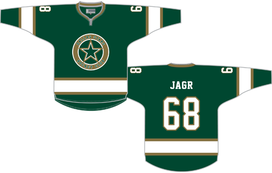
Of those, I managed to get one right when I drew up a concept for them a couple months ago, so I figured since I hate hockey a little less today I’d get around to posting that concept.

There were two things I was trying to do with this. One is the elimination of black (and therefore a switch to green as the primary color, which Heika says will happen). The other is a traditional look that calls on the franchise’s history.
This design is heavily based on the look worn by the Minnesota North Stars in their inaugural season, with the original colors swapped out for their modern equivalents. It’s simple, it’s clean, and it sounds like it’s not the direction the team is going, so it’ll be interesting to see what they do come up with.
Update – 1/7/2013, 9:45 AM: After chatting with Chris Creamer of SportsLogos.Net about what a new Stars logo might look like, I decided to update my concept to use a new logo. I think it’s derivative and looks better as a shoulder logo, but I figured I’d post it anyway.

It’s also worth noting that, as with my Winter Classic concepts, I would expect laces on both of these designs but I’m too lazy to update my template to show them.


